THEME DEVELOPMENT
One of my strong suits is the ability to look at things as a big picture, which has helped me in developing our book's theme. Is this something we are going to carry out in the rest of our book? Do these colors portray the tone of our theme? How does this module relate to our theme? These are all questions I constantly asked myself as well as other designers. Even though I'm no longer in the role of design editor, I still challenge the designers with these questions. I love helping them create theme related pages, giving them theme related ideas, etc. These are some of the biggest theme related projects I worked on.
Opening Copy Design
Given the task to design the first pages of the book was very challenging. This project took a couple months to perfect, however being able to collaborate with another head designer on it really helped and it turned out great. We introduced all of our colors, fonts, and theme related design concepts used throughout the whole book like layering, photos coming out of their frames, etc.

Blanc Slate Dividers
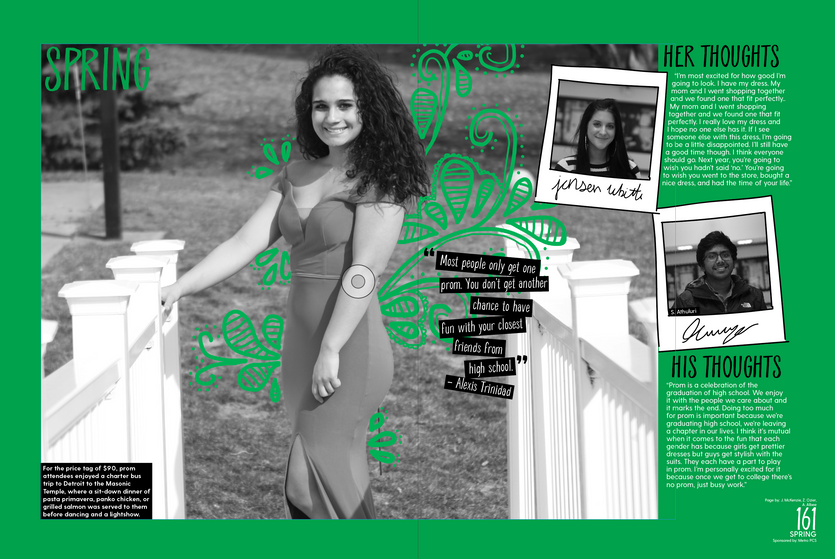
My first year as a designer I was given the task of coming up with a concept for our divider spreads. After finding a lot of creative inspiration and consulting with the other designers, I came up with a look for them and designed most of these spreads. These fit our theme because we incorporated "doodles" and polaroid pictures throughout our whole book. The colored spreads show that it's a specialty page and force you to look it.
One More Thing Minimags
For this book we had two minimags and they each took a lot of planning. We wanted them to be theme-related but still stand out from any regular theme feature page. After a lot of meetings with the editors-in-chief, theme editors, designers, and our adviser we came up with the two concepts of writing legacy letters for your THING, and letters to your past self, the opposite. Then, with this, I found a lot of inspiration from magazines and came up with this new color palette that is more calm than the one we used in the rest of the book. I also designed a couple pages for these minimags.


